Timo Gaessner
Week 01 — Arrival
Sep 20, 2015
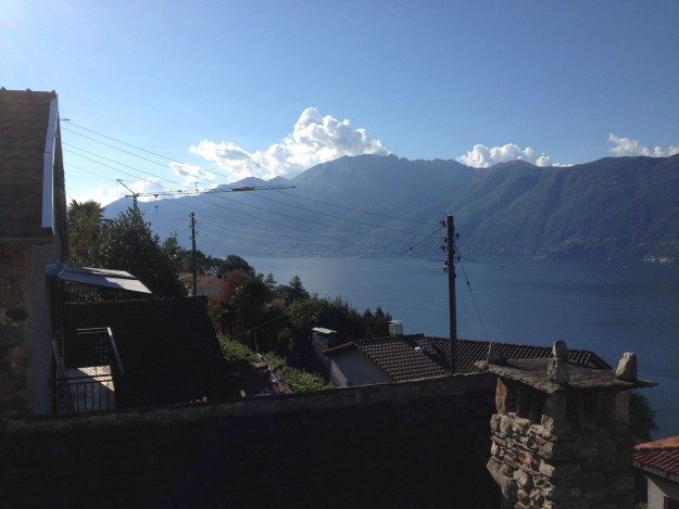
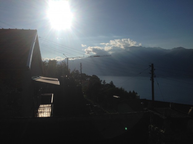
From my arrival until yesterday, it’s been pretty rainy in Vairano. The weather app predicted a 100% certainty of rain over a period of five days and that is exactly what happened. Unlike other places I’ve been and visited before, rain here seems to be somewhat more intensive and wet. I’ve used the indoor time to settle in, prepared a little desk in front of a window (overlooking an always impressive lake Maggiore) and (re-)considered my project proposal to the Sasso Residency.
I have studied graphic design, yet my interest in letters took roots in an sign-maker apprenticeship I did beforehand. During my studies and up to many years later, becoming a type designer has never occurred to my as an option of profession. Reflecting on it now, it’s mostly due the fact that I’ve experienced type design always with a conation of the upmost possible set of rules and dogmatisms.
I have proposed a project that could be loosely described as an abstract introduction to type design. Aiming for a little guidance, helping to look at forms and it’s relations within a typographic system in order to understand and develop a (visual) sense to its rather basic shapes and their relations — without false dogmatisms and how-to lectures.
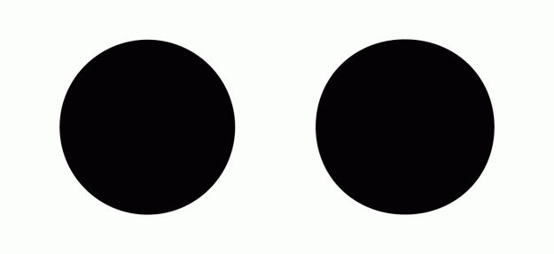
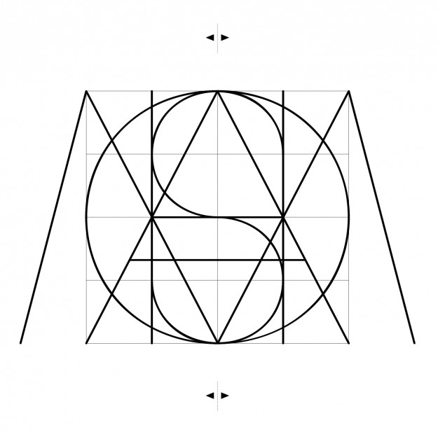
Once, somebody claimed that a trained type designer is able to see a difference of up to 1µ in a curve or a form. That’s one micro inch or one millionth of a millimeter. I doubt this is true. However, find above a simple example of mathematical vs. optical curves and stay tuned for more.
Week 02 — Rhythm and Flow
Sep 28, 2015
I admit, I’ve had a hard time finding some sort of productive rhythm and flow in this beautiful surrounding during the last week. The weather’s been lovely after all and I’ve often walked down to the lake for a swim.
While trying to take various paths downhill, I’ve often passed by this little corner store (which is by the way, also the next possible shopping option up here):
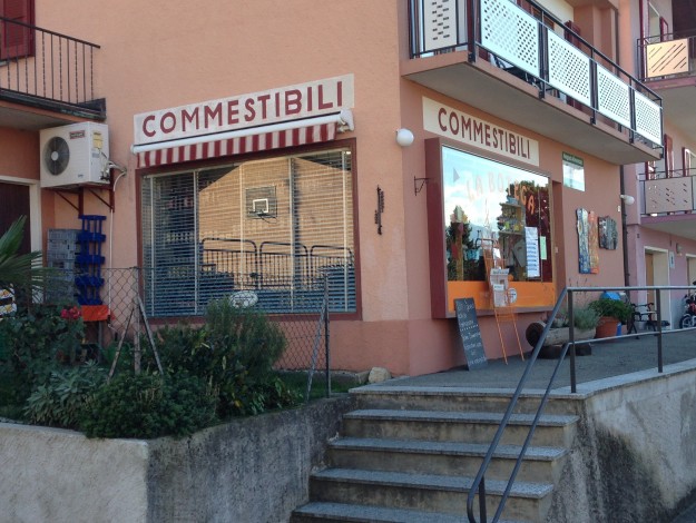
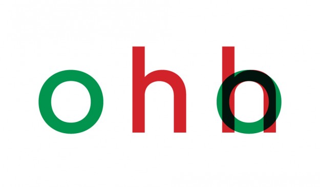
It appears the sign painter of this shop also had a hard time finding his rhythm and flow. The width of the letters COMMESTIBILI (food) are varying extremely and provide a well fitting charm to the outfit. A good example of one of many unintended styles choices amateurs repeatedly are doing. I believe that it’s mostly due the fact that letters seems to be based on a mathematical schemes or forms, when it’s actually better based on optical decisions. However, see an example of an corresponding width below.
Week 03 — Groovy
Oct 5, 2015
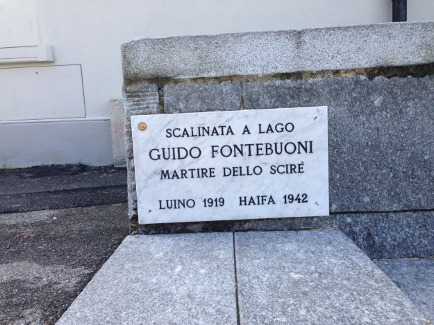
Finally, I got into some sort of groove. A view mornings I have spent collecting and harvesting quinces, grapes and figs that grow around the property. Other afternoons, I went across the boarder, mostly around Luino, to have a proper coffee and shop affordable delicatessen. In between I often found pleasure in running into old signages—mostly set in custom made typefaces—and finding odd peaces of graphic design while walking around.
After working on basic optical laws to beginn with, I continued researching (possible) construction principles of letter forms. It appears that this basic method of constructing capital letters we now up until today, has been developed almost 2000 years ago. Most serif types you’ll find around are still based on this principle, first applied to ‘Capitalis Romana’. The first lower case characters date back approximately 700 years later—apparently one of the last significant inventions to type design.
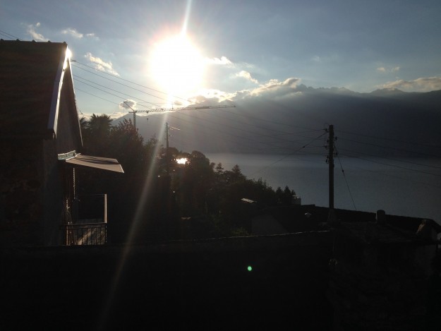
Week 04 — Sundowner
Oct 10, 2015
My last week in Vairano I’ve spent slightly melancholic, knowing I will have to leave soon. Reality caught up and I was busy doing ‘daily business’, writing a lot of emails and discussing rather surreal appearing topics via phone while overlooking Lago Maggiore.
On one of my last strolls around I’ve seen a beautiful old geometric sans serif painted on a garage, somewhere on the way to Bellinzona.
Lately, it seems like most designers, when attempting to draw their first typeface eventually, chose to draw a geometric sans. Somehow apprehensible, since the simpleness of the geometric form is offering orientation and it also seems to be approachable.
In fact, it’s quite the opposite. Due the reduction of basic forms and the implementation of geometry, details become more relevant and disharmonies reveal distinctively. The attempt to establish a dogmatic, mathematical system to help executing typefaces have never worked too well.
Getting lost in drawing a single letter seems also quite common, even along professionals. Endless possibilities are making one forget about the bigger picture, the language, a system when written, expressed through many variations of glyphs, the typeface.
A system of which by establishing formal analogies, it start to become much more then the form it self…
…
I will miss this. Thanks for having me.